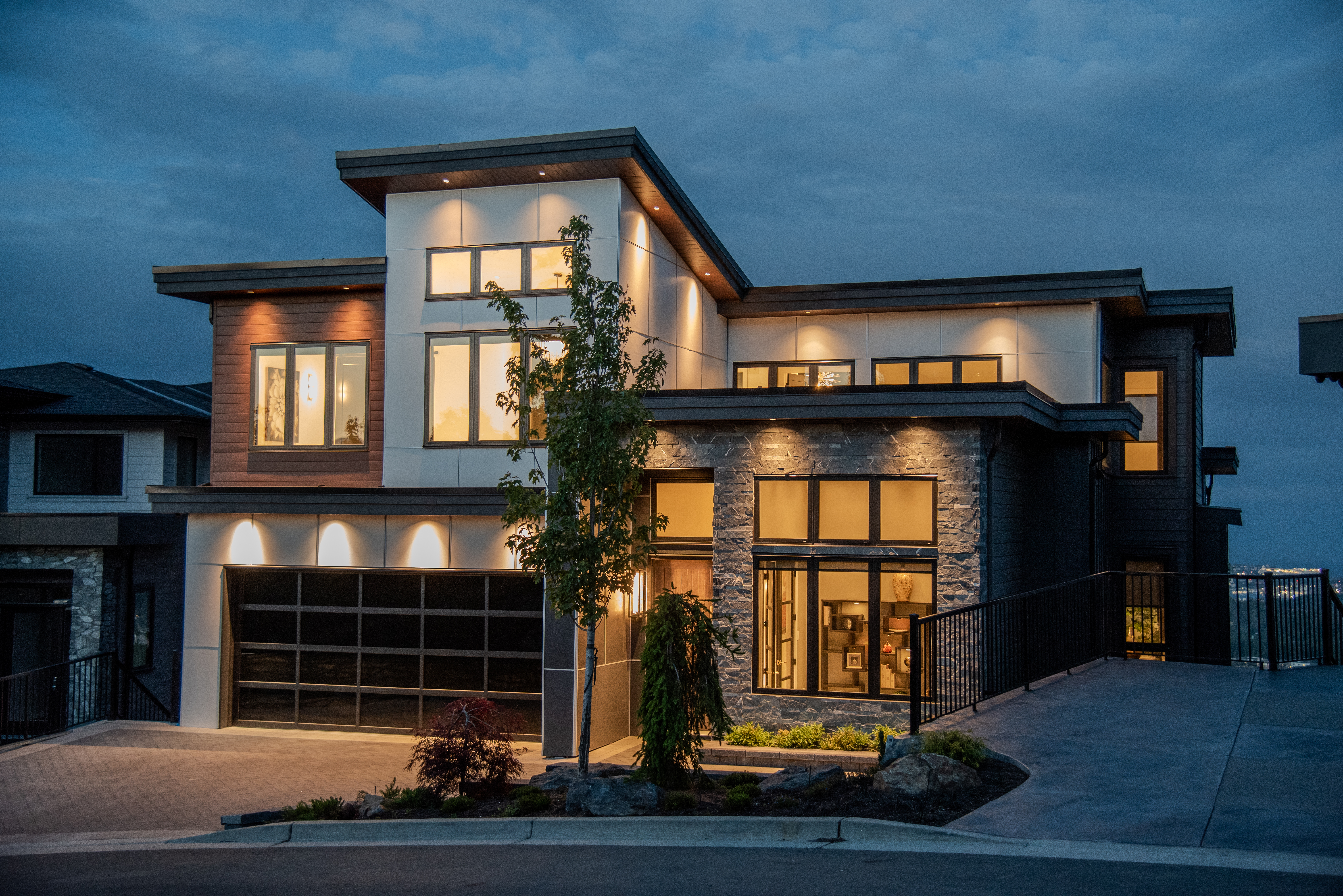
The Navigator at dusk — stone cladding, white composite panel, cedar accent, black frames. The exterior already telegraphs what's inside: warm materials in tension with cool ones, wrapped in darkness and light.
Most interiors have a palette. The Navigator has a design system — a set of relationships between materials, tones, and light that repeat across every room and create a home that feels considered no matter where you stand in it.
This is a room-by-room analysis of how that system works: the specific colours and materials, the lighting strategy, the emotional register it creates, and the design principles that underpin all of it. Not as a style guide to copy, but as a case study in how the best interiors are built — deliberately, from a clear point of view.
The Palette
Eight colours. One system.
The Navigator's interior palette is not complicated — it's disciplined. Eight tones, each occupying a specific role. The warmth comes from walnut, champagne ivory, and quartzite. The edge comes from charcoal slate and matte black. Champagne gold threads through all of it.
Champagne Ivory
Floor tile · Primary neutral
#E8E0D4
Warm Walnut
Upper cabinetry · Millwork
#8C5E3A
Charcoal Slate
Lower cabinetry · Surface base
#525663
Quartzite Rose
Island stone · Centrepiece
#C4A99A
Marble Grey
Backsplash · Secondary stone
#A5A8AF
Matte Black
Hardware · Frames · Punctuation
#1C1C1E
Champagne Gold
All fixtures · The thread
#C4A46A
Taupe Mink
Accent walls · Wallcovering
#9A8B7A
The critical insight about this palette is the warm-cool opposition held within it. Walnut is warm. Charcoal slate is cool. Quartzite rose is warm. Marble grey is cool. Champagne gold is warm. The house never lets one side win — and that tension is what keeps it interesting.
A palette with only warm tones becomes a cave. Only cool, a hospital. The Navigator holds both — and that's why no room feels like a mood.
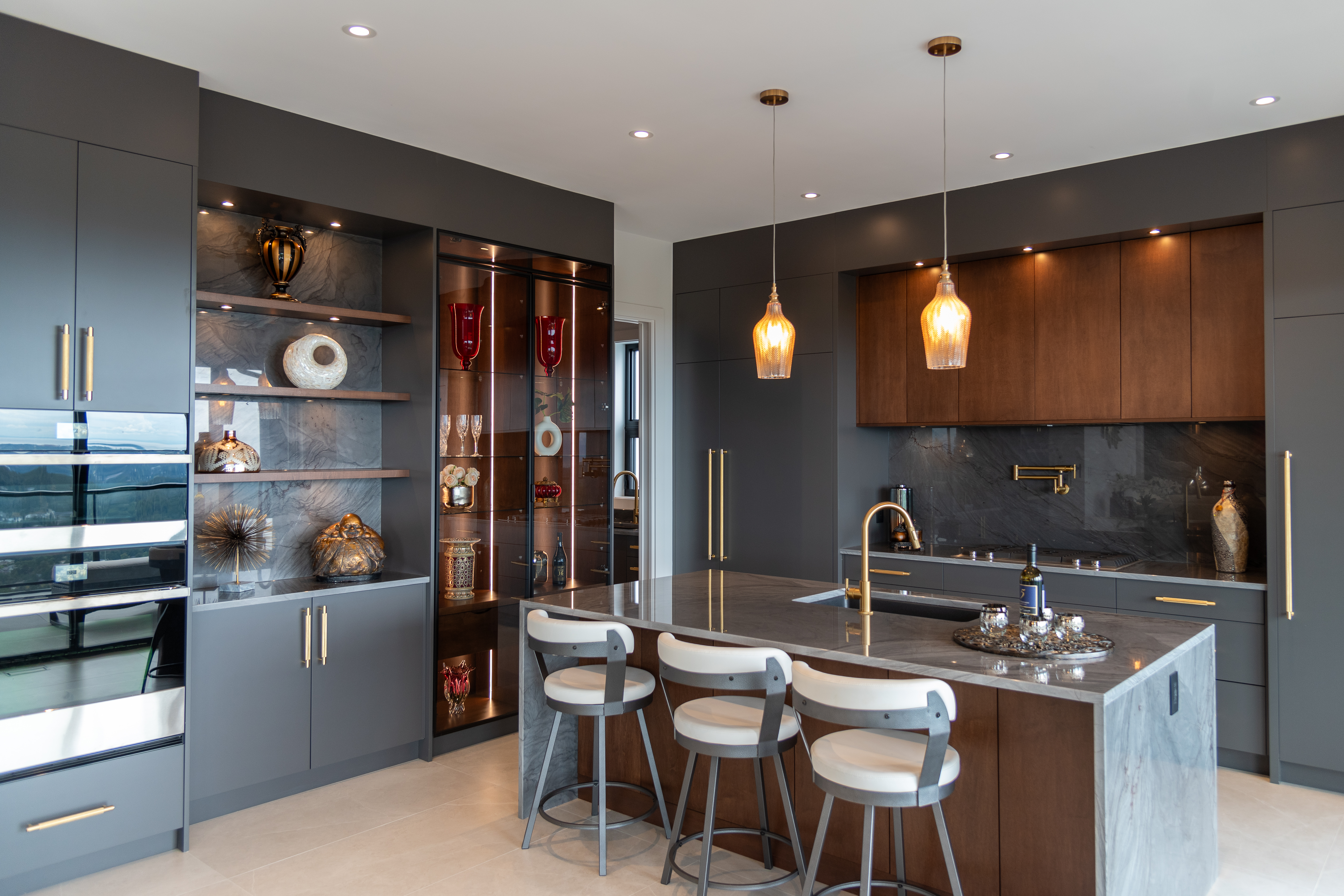
The kitchen — walnut uppers, charcoal lowers, quartzite island, amber Murano pendants, and a backlit display cabinet curated like a gallery. Every material is warm but the palette is perfectly counterbalanced.
The Materials
Six materials. Every one chosen twice.
Each material in the Navigator was chosen for two reasons: how it performs on day one, and how it ages. A material that degrades becomes a cost. A material that improves becomes an asset. The six principal materials here were selected on both criteria.
Quartzite
The kitchen island — a dramatically veined slab with rose and grey movement. Harder than marble, it won't etch from acid. Every slab is unique; no two kitchens can ever be identical.
Walnut Veneer
Upper cabinetry and display cabinet. The honey-amber grain absorbs evening light and glows. Unlike painted finishes it improves with age — the grain deepens, the warmth intensifies.
Large-Format Porcelain
The floors — champagne ivory, 24×48 slabs. Fewer grout lines means a cleaner visual field. Porcelain holds its surface indefinitely; no sealing, no etching, no fading.
Champagne Gold Metal
PVD-coated brass — kitchen faucets, pot filler, cabinet pulls, towel bars, mirror frames, pendant armatures. Brushed finish hides fingerprints; PVD coating resists tarnishing for decades.
Frameless Glass
Tinted glass railings and shower enclosures — eliminating visual barriers so the view is never interrupted. The tint adds privacy without opacity and gives glass a presence of its own.
Fluted Wood Slat
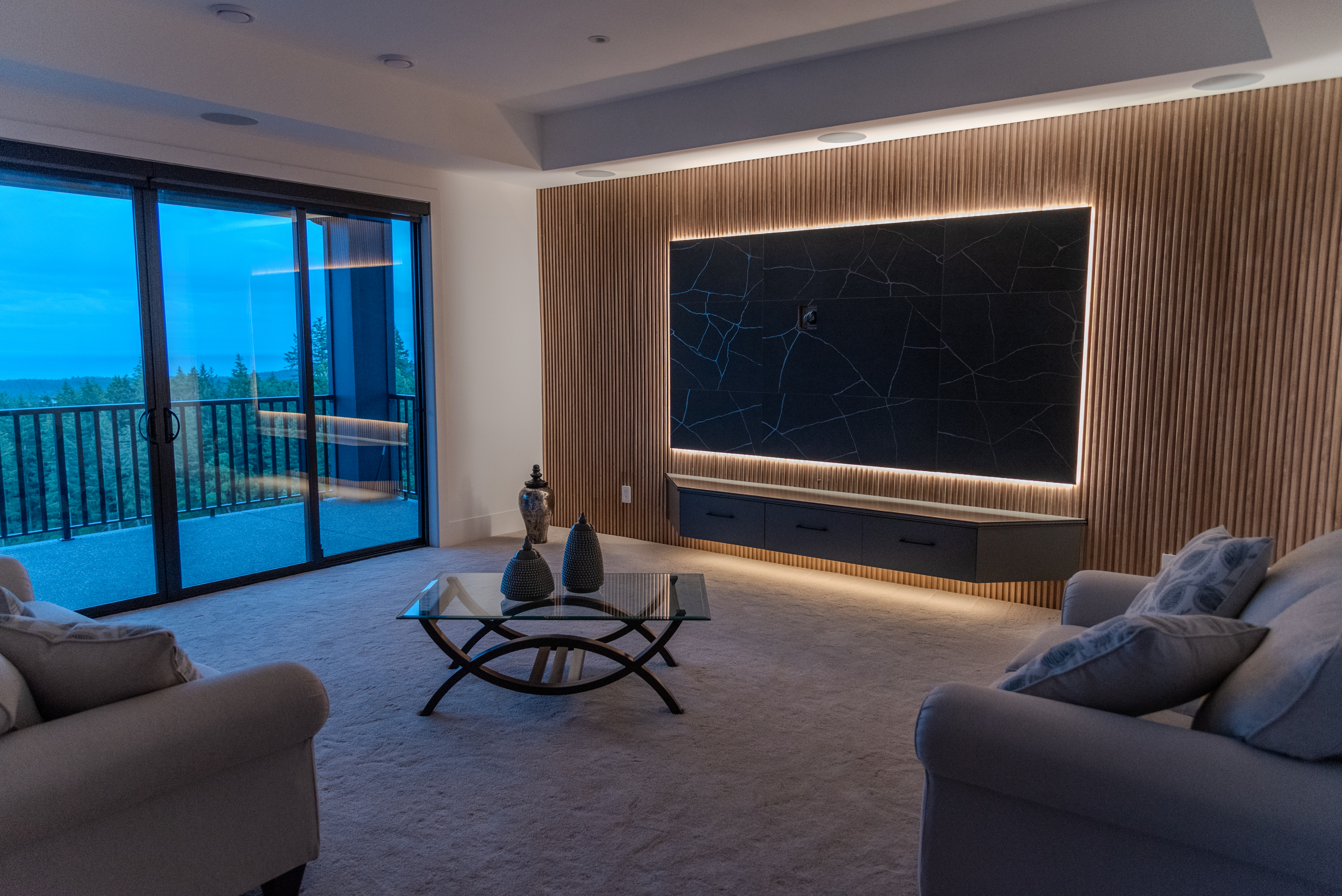
The lower-level feature wall — vertical oak slats at regular intervals, backlit with a warm LED strip. Texture without pattern. The fluting catches and releases light as you move; a static material that feels alive.
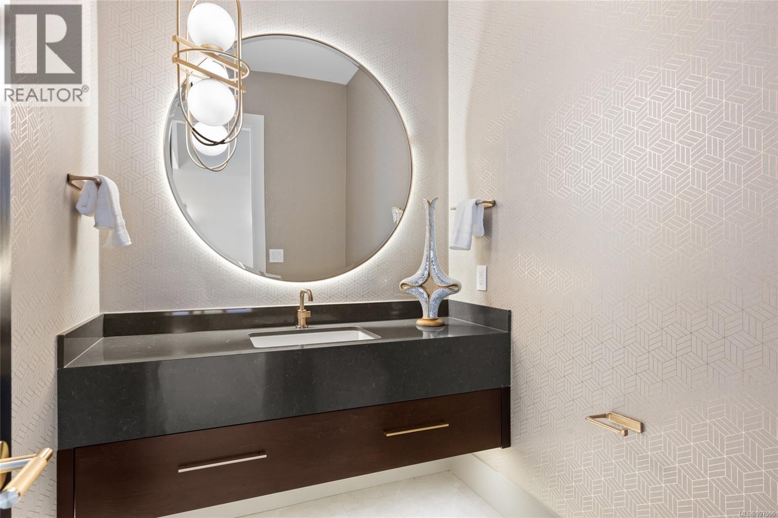
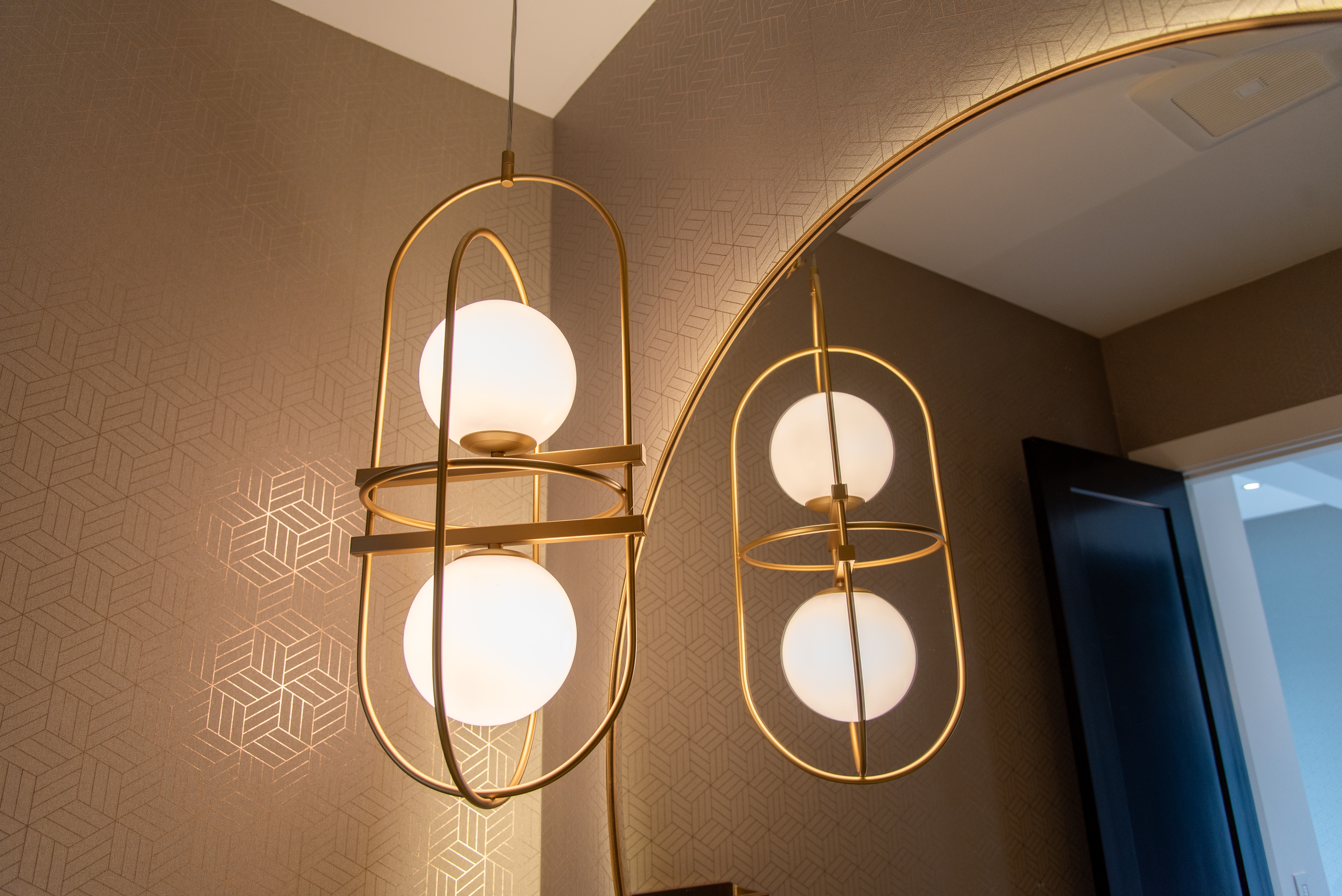
Left: The powder room — backlit round mirror in brushed gold, geometric tone-on-tone wallcovering, floating black stone vanity. Right: The entry pendant — sculptural gold orbiting rings with frosted globes, reflected in the arched mirror. Light as jewellery.
The Unifying Element
Gold is the sentence that connects every room.
Walk through the Navigator and count the gold: the kitchen faucet, the pot filler, the cabinet pulls, the island barstools, the pendant frames, the bath faucets, the mirror frames, the towel bars, the towel ring, the shower robe hook, the door lever handles, the wall sconce armatures. It appears in every room without exception.
This is not accident. The champagne gold finish — slightly warm, slightly brushed, never shiny — acts as the visual thread that ties together spaces that would otherwise read as disconnected. You don't notice it consciously. You feel it as coherence.
The design principle: Choose one finish for all hardware across the entire home and do not deviate. It requires discipline — finding the right faucet, the right pull, the right handle all in a single finish takes time. But the result is a home that reads as a single composition rather than a collection of individual rooms. At the Navigator, that finish is champagne gold. Every. Single. piece.
The other binary hardware decision — and equally important — was matte black for everything structural and mechanical. Window frames, shower controls, towel warmers, door frames, railings. Black says: this is infrastructure. Gold says: this is craft. Together they give the home its edge-meets-warmth character.
Lighting Strategy
Three tiers of light. Each with a different job.
The Navigator was designed to come alive at dusk. The exterior night shot says it clearly — warm light spills from every window, and the house glows against the blue-dark sky. That quality is not accidental. It's the result of a disciplined three-tier lighting strategy that most homes never implement.
01
Ambient
Recessed LED downlights in coffered and tray ceilings. The base layer — bright enough to work in, warm enough to live in. Tunable white temperature to shift the room from 4000K (daylight working) to 2700K (evening warmth) with one switch.
02
Accent
LED cove strips behind ceiling soffits, under cabinet task lighting, internal display cabinet illumination, and LED floor-to-wall uplighting. The accent layer creates depth and dimensionality — shadows and highlights that make a flat room read as three-dimensional.
03
Decorative
The sculptural pendants — orbiting gold ring pendants in the entry, amber Murano glass teardrop pendants over the island, an LED infinity loop in the master bath, globe and cage sconces in the living areas. These are art objects that happen to produce light. They are the punctuation of every room.
The lower-level family room at dusk — fluted oak slat feature wall with warm LED cove behind it, dark stone TV inset with accent lighting, black-framed sliding glass wall opening to forest views. All three lighting tiers visible in a single frame.
Texture
Texture instead of pattern. Always.
The Navigator uses almost no pattern. What it uses instead is texture — and the distinction matters enormously. Pattern decorates. Texture enriches. Pattern asks for attention. Texture rewards it.
The exceptions prove the rule: the geometric wallcovering in the powder room and entry is tone-on-tone — champagne on taupe, the same value, so the pattern reads as a surface quality rather than a visual event. From across the room it looks like a rich matte wall. Up close, a deliberate geometric lattice catches and reflects the light. That ambiguity is what gives it sophistication.
Everywhere else: texture from material, not from pattern. The walnut grain. The stone veining — no two quartzite slabs share the same movement. The fluted vertical slats, which catch light and cast micro-shadows at every moment of the day. The burnished matte of the black hardware against smooth stone. The warmth of a brushed gold pull against the cool lacquered surface of a cabinet door.
A pattern is a decision made once on paper. A texture is a decision that lives in three dimensions and changes with every light condition, every time of day, every season.
Complementary Palette
What works with the Navigator palette — and why.
The Navigator's base palette is anchored: warm neutrals, cool stone, champagne gold, matte black. The question for art, textiles, and accent objects is: what do you layer into it? Four colours work particularly well, each validated by choices already visible in the home.
Deep Navy
The exterior window frames and tinted glass door panels prove it: deep navy-black creates dramatic depth against warm stone and wood without competing with the gold. Use in upholstery, cabinetry insets, or art.
Terracotta
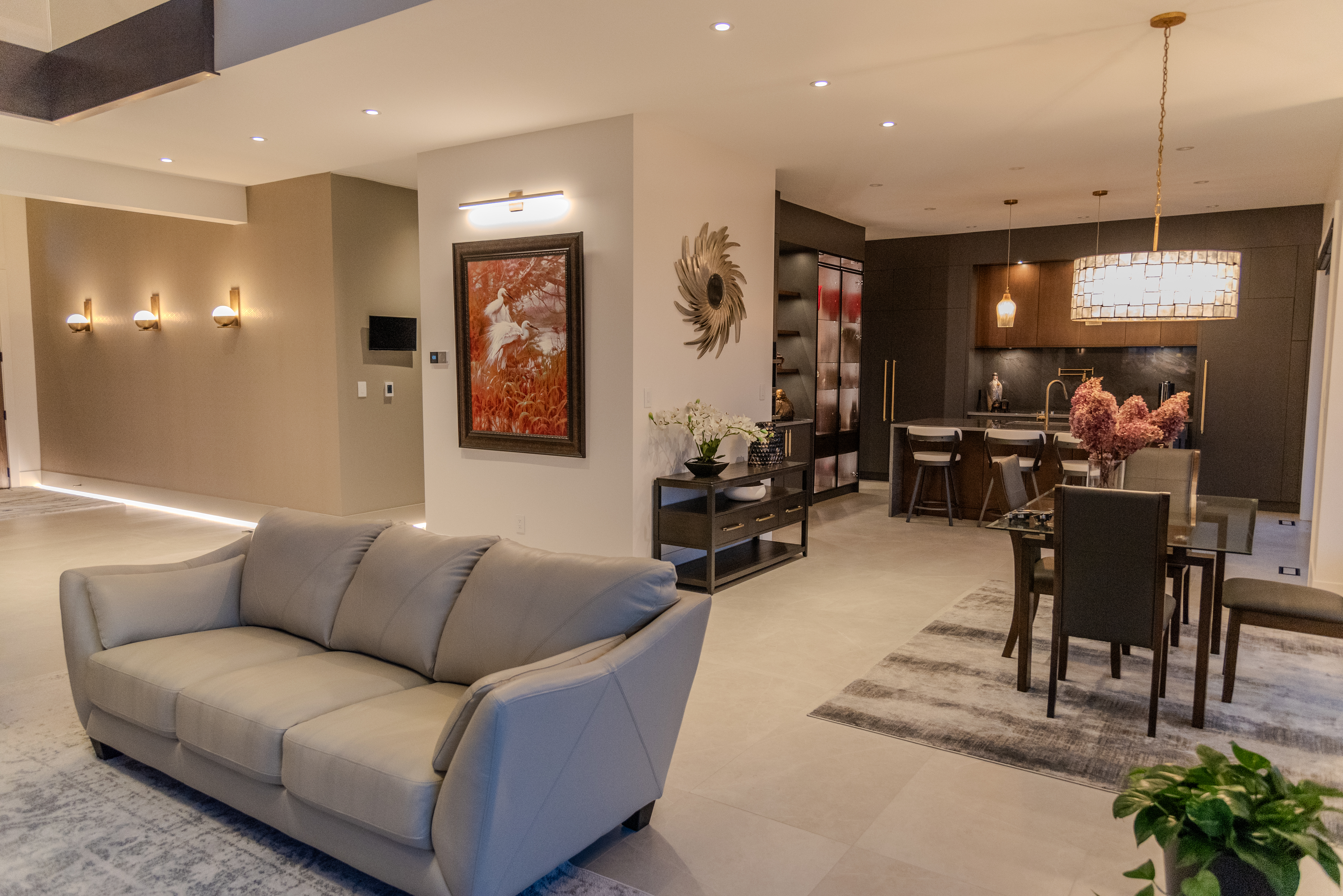
Already present in the main floor artwork — a red-orange bird painting against the taupe wall. Warm red-orange is the natural complement to charcoal and champagne gold; it vibrates with energy without clashing.
Forest Sage
The natural landscape beyond the glass walls — Japanese maple, birch, evergreen — brings sage and forest tones inside as living artwork. Sage in textiles bridges the interior palette to the exterior environment.
Deep Plum
The darkest complement in this palette's register. Against champagne gold and warm walnut, deep plum reads as deeply sophisticated — ideal for a bedroom or library where intimacy is the goal.
The main floor — the terracotta bird painting does exactly what complementary colour should do: energise without disrupting. The taupe accent wall, grey leather sofa, and gold sconces frame it perfectly. The room needed that warmth and the art delivers it.
Design Principles
Four principles the Navigator teaches.
1
Choose one finish for all hardware. Commit completely.
A home with mixed hardware finishes — some gold, some chrome, some nickel — reads as indecision. The Navigator chose champagne gold for every faucet, pull, handle, bar, hook, and pendant armature in the building. The discipline is what creates coherence. The moment you allow a single exception you've broken the sentence.
2
Hold the warm-cool tension. Never let one side win.
Every room pairs a warm element against a cool one. Warm walnut against cool charcoal cabinets. Warm quartzite island against cool marble backsplash. Warm taupe walls against cool grey sofa. Warm amber pendants against cool grey ceiling. The tension is what prevents the home from feeling like a mood board rather than a home. One-sided palettes feel either heavy or cold. Both together feel alive.
3
Make light a material, not an afterthought.
Light is typically planned last — after materials, after finishes, after furniture. At the Navigator it was planned alongside the architecture. The LED cove in the great room ceiling, the under-cabinet lighting in the kitchen, the backlit fluted wall in the family room — these are structural decisions, not decorative ones. Layered light is what separates a finished space from a lit-up room.
4
Pendants are furniture. Choose them like art.
The sculptural entry pendant — orbiting gold rings with frosted globes — would be a statement object in a gallery. It happens to also produce light. The amber Murano glass pendants over the kitchen island were selected for the quality of their warm glow, but also for their silhouette against the high ceiling. Decorative lighting that doesn't work as a visual object is a missed opportunity. At the scale these pendants occupy, they're the first thing your eye finds in any room.
The Navigator's interior is a useful study not because it's aspirational but because it's legible. Every decision connects to a principle. The gold is everywhere for a reason. The warm-cool tension is deliberate. The three-tier lighting is structured. The texture is chosen over pattern, every time.
That kind of design isn't about taste — it's about discipline. You can have extraordinary taste and still produce a chaotic interior if the decisions don't connect to each other. What the Navigator demonstrates is that a coherent design system — even a simple one — elevates every individual choice within it. The whole is greater than the sum of its materials.
At MOVA, we carry these principles into every property we build. The finishes change. The palette adapts to the site, the neighbourhood, the unit type. But the underlying discipline — of coherence, of intentional tension, of light as architecture — stays constant. Because that's what separates a beautiful home from a beautiful photograph of a home.
Design this deliberate doesn't happen by accident.
Every MOVA property is built with the same discipline — from palette and material selection to lighting strategy and hardware finish. If you'd like to understand how we approach design in the projects we're building next, let's talk.